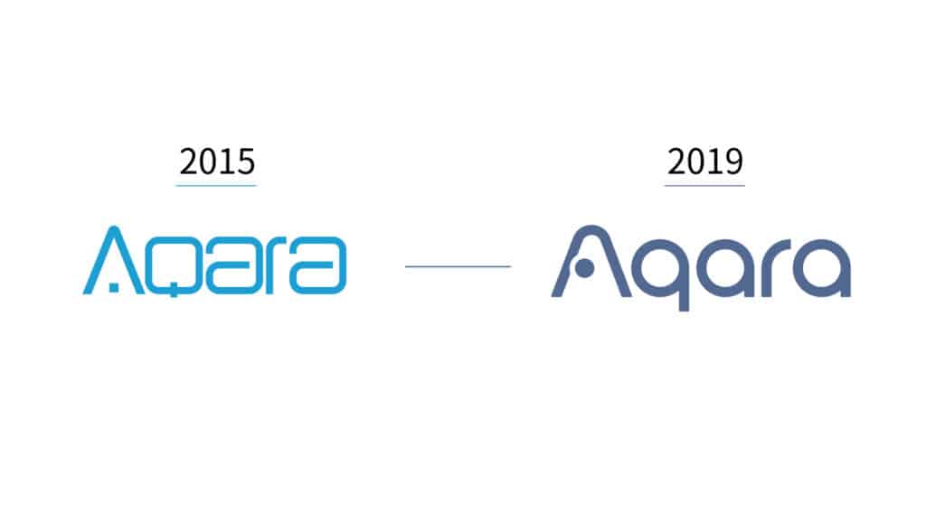
The Aqara brand has been established in 2016 as part of Lumi’s official, in-house brand, and its products have quickly become the leading smart home and IoT provider, and are also making promising debuts worldwide. In celebration of Lumi’s ten-year anniversary and to welcome the upcoming decade, we gave the Aqara brand a new makeover. We adopted the “Classic Blue” and a new logo to give our brand identity a more vibrant, friendly, and yet innovative look and feel.
The letter “A” in Aqara mark represents the house. The blue dot inside the A, which also looks like our Aqara Hub, represents the wireless signal that bridges all the smart devices together under one roof. The new Aqara logo has a rounded design to express the feeling of warmth and family. The logo design also reflects the Aqara products themselves, which all have a graceful, clean, and minimalistic design. While the Aqara mark translates the feeling of the brand, the permanent blue color symbolizes trust, reliability, and our expertise in the smart home and IoT industry.
Our tagline, “Continous Connection”, represents the heart of what we strive for as a Company. First and foremost, we hope to build seamless connections across our wireless smart home devices in order to elevate our customers’ daily lifestyles and to unlock the potential of everyday living. But just as importantly, we hope to build a continuous connection with our users by building the best service, outreach, and support for our new and existing users all over the world.


